SOCIAL HABITS • PRODUCT DESIGN • 2026
What if saving something didn't require organizing it first?
ROLE
Product Designer
TIMELINE
3 MONTHS
TIMELINE
UX Strategy
Interaction Design
Behavioral Design
Mobile Product Design
01. TL;DR
People already have ways to save things. The problem is finding them again.
Kivora explores a simpler way to save screenshots, links, images, and ideas without forcing people to organize them before they can move on. Instead of making folders and structure part of the capture process, I designed the experience around a faster loop: save first, organize when it matters.
The goal was to make saving feel effortless while giving people a reliable place to return to everything they found useful.
06. SOLUTION
Shaping Kivora around how people actually save.
Make saving almost effortless
I redesigned capture around one idea: save first, organize when it matters. Users can save immediately and choose a Collection only when they need to.
03. PROBLEM
Thinking beyond the interface.
People constantly save things they want to remember. A screenshot goes into Photos, a link disappears into browser history, and a useful reference ends up somewhere else.
I’ve been stuck trying to find that one screenshot of a resource I saved months ago. When I finally needed it, it was buried somewhere among a thousand other screenshots. And of course, I had no idea when I saved it.
Tools make saving easy, but often make users organize before they can move on, so I wanted to separate the two moments: capture should be fast, while organization can happen when it becomes useful.
How might we let people capture anything in seconds without making it harder to find later?
07. DESIGN EXPLORATION
Shaping the Vision
Before settling on the final experience, I explored different ways Kivora could make saving feel effortless without making organization harder.
Challenge
Saving was fast. Finding it later wasn't.
I wanted Kivora to make capture effortless while still giving users a simple way to organize and return to what they saved.
How much does the user actually need to see?
Kivora initially had useful features like Workspaces, Analytics, and Insights, but adding more information also added more decisions. I had to figure out what genuinely helped the core save-and-retrieve experience.
Solution
Designing for capture first, organization later
I built the experience around three things: fast capture, simple organization, and easy retrieval.
And also choose to remove analytics and Insights
There were collections and workspace both existing in the 1st version so i removed the workspace and combined it with the same collections so that users can have less confusion selecting where to save .
Every decision came back to one question:
“Can I save this now and find it when I need it?”
Making onboarding easier to understand
I wanted users to understand the value of the app without reading too much. I broke the introduction into simple messages that explain the core idea and get users started quickly.
Finding a simpler way to start a challenge
I wanted users to start quickly without making too many choices. I explored different flows and broke them into smaller steps, starting with their interests and guiding them to a challenge.
Making progress feel more meaningful
At first, I focused mainly on completion. It felt too much like a tracker, so I explored using progress, streaks, posts, and milestones to make the journey feel more rewarding.
06. DESIGN ITERATIONS
Designing, challenging, and refining the experience
The first direction wasn't solving the problem as well as I thought. Feedback from people familiar with research challenged my assumptions and helped me simplify the experience around how people actually learn.
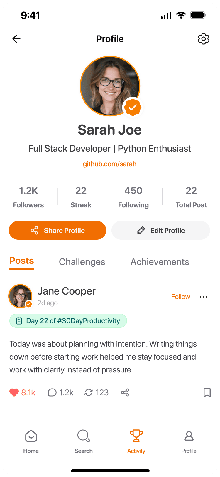
BEFORE
The large progress circle took up most of the space, while the important challenge details were pushed down. There was a lot of information competing for attention.
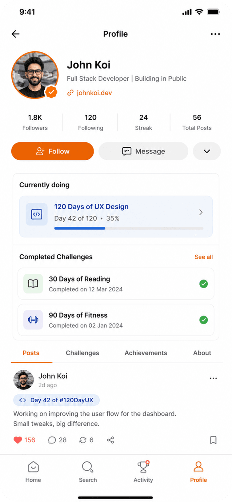
AFTER
I moved the focus to the user’s current streak and challenges, while keeping the key stats visible. The new layout feels lighter and makes it easier to see where I am and what I’m working on next.
06. CONCLUSION
Connecting the Final Dots
Designing Challenge taught me that building a habit product isn't about adding more features it's about removing friction and making the next step feel obvious.
Every design decision was measured against a simple question:
"Will this help someone come back tomorrow?"
Rather than chasing screen time, I focused on creating an experience that rewards consistency, encourages accountability, and helps users make meaningful progress every day.
Looking Back
What began as a simple idea for a social challenge app evolved into a deeper exploration of behavioral design. I learned that lasting habits aren't built through motivation alone—they're built through thoughtful product decisions that reduce friction, reinforce progress, and make returning feel natural.
Lessons I'll Carry Forward
This project reshaped the way I approach product design. Instead of asking, "How can we make users spend more time here?" I now ask, "How can we make coming back tomorrow feel effortless?" That mindset designing for long-term behavior rather than short-term engagement is something I'll carry into every product I build.
05. USER RESEARCH
Where Learning Started to Break Down
I came across people ( reddit ) talking about how they save useful screenshots, links, and references, only to struggle to find them again later. It made me realize the problem wasn't saving things. It was losing them in everything else we'd saved.
That gave me a hypothesis to explore:
Could saving be effortless while still making things easy to find later?