01. TL;DR
People collect things they want to save for later. The problem is finding them again.
Kivora is a local-first save-and-organize app for links, screenshots, images, PDFs, files, and notes. Instead of asking people to organize something before saving it, Kivora lets them save first and organize when it matters.
The goal was to make saving feel effortless while keeping everything easy to find and use later.
ROLE
Product Designer
Design Engineer
TEAM
SOLO
TIMEFRAME
8 Weeks
02. PROBLEM
Thinking beyond the interface.
People save things they want to remember. A link for a project. A screenshot of a design. A PDF they might need later. A note they don't want to forget.
But over time, these things get scattered across bookmarks, screenshots, downloads, notes, and chat messages. When you need something again, you often remember what you saved, but not where you saved it.
I wanted to explore a simpler way to collect useful things without making organization part of every save.
How might we make saving quick without making it harder to find things later?
03. SOLUTION
Shaping the Experience
Make saving almost effortless
I redesigned capture around one idea: save first, organize when it matters. Users can save immediately and choose a Collection only when they need to.
Give saved things a place to belong
I simplified Kivora's information architecture around one user-facing organizational concept: Collections. Instead of making users understand Workspaces, Albums, and Boards, saved items live in Collections, while everything else becomes a way of interacting with them
Turn Collections into visual spaces
Not every collection needs to be a grid. Moodboard became a view inside a Collection, allowing users to freely arrange images, links, and other saved content without creating another organizational entity.
Make anything findable
I designed retrieval around the idea that users shouldn't have to remember exactly where they put something. Search, filters, Collections, Favorites, Recently Saved, and List/Grid views give users multiple paths back to their saved content.
04. USER RESEARCH
People weren't struggling to save things. They were struggling to come back to them.
People weren't struggling to save things. They were struggling to find them again.
I noticed people repeatedly saving links, screenshots, references, and resources with the intention of coming back later.
But those things ended up scattered across bookmarks, screenshots, downloads, notes, and messages.
I used Reddit discussions and existing saving workflows as directional research to identify recurring behaviours.
WHY KIVORA?
They solve a different problem. Kivora is designed around the moment before organization — when you simply want to keep something.

Success Metrics
I wanted to know if Kivora actually reduced the friction after saving.
Rather than measuring how many things someone could save, I focused the early product around three questions:
Can someone save something without being forced to organize it first?
Can they find something later without remembering exactly where they put it?
Can they understand the difference between a Collection, a saved item, and a Moodboard without explanation?
These became the criteria I used to evaluate the product as the interface evolved.
05. DESIGN EXPLORATION
Exploring how saving could become a personal collection of useful things
Before settling on Kivora's final experience, I explored a simple behavior:
We constantly come across things we don't need right now but might need later a useful link, a screenshot, a design reference, a PDF, an image, and a note we don't want to forget all captured in one place.
Challenge
You have to decide too early.
Many tools ask you to choose a folder, workspace, page, or database before you can save something. That adds friction when you're simply trying to keep a useful link, screenshot, or reference for later.
Saved content gets scattered.
Links, screenshots, files, and notes often end up across different places. Over time, the information is still there, but finding the thing you saved — and remembering why you saved it — becomes harder.
Solution
Designing a capture-first experience
Instead of making organization part of every save, I focused on letting people collect first and organize when it matters.
Every exploration was guided by one question:
“What should help the user after they save something?”
Finding a simpler way to collect information for later.
I explored how Kivora could make collecting useful information feel natural. The flow starts with a quick capture, keeps everything in one library, and lets users organize it into Collections whenever it makes sense.

06. DESIGN ITERATIONS
Simplifying Kivora around how people actually save
The first version had the right idea, but I was adding structure and more and more features before understanding how much users actually needed. I explored different ways to capture, organize, and revisit saved information, then simplified the product around one principle

BEFORE
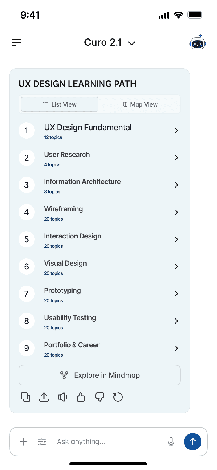
Dark purple gradient felt unnecessary the structure and content didn't feel the same as the chat screen. It felt like a whole different app.
AFTER
I went back to a light blue header that feels like the same family as the chat screen. The list is flat and numbered now just a clear path from 1 to 9 so users always know where I am without looking for a separate bar.

BEFORE
Empty screen felt cold. No personality, no welcome. Just a blank box waiting for input. The send button was a harsh black square. Felt like a form, not a conversation I would make while using.

AFTER
Robot mascot adds a feeling of researching buddy feels like a real greeting. Rounded send button with an arrow feels friendly. The screen invites you to start.
BEFORE
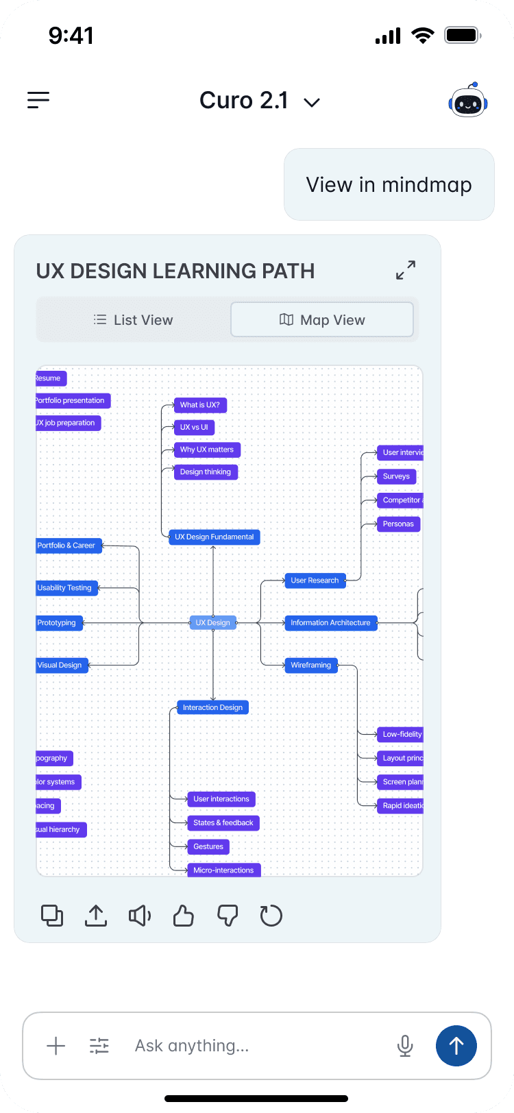
The map showed the topics, but I wasn't sure what should happen when someone reached the end of a branch.

AFTER
I made the final nodes open directly into the lesson, so users can move from exploring a topic to actually learning it.
07. CONCLUSION
Turning Research Into a Connected Learning Experience
Curo started with a simple observation: AI can answer questions, but learning doesn't end with one answer.
The real challenge wasn't building a smarter AI. It was designing what comes after the answer. Structured paths, connected concepts, and a sense of progress are things AI chat alone doesn't give you.
What I'd do differently: I started with people already comfortable with deep learning, which sharpened the problem but narrowed it. Running research earlier with a wider, more casual audience would have pushed the design to work harder for the people who need it most.
Looking Back
Curo started with a simple observation: AI can answer questions, but learning doesn't end with one answer.
I explored how research could become more structured and connected, bringing together learning paths, topic exploration, and Mind Maps to help people build deeper understanding.
Lessons I'll Carry Forward
Better AI experiences aren't only about better answers. They're about helping people understand what to do with them next.
I would probably try to get as many perspective of people using AI for their needs to reduce the scope mid project .